Brand assets
The kit, free to take
Slates, stream overlays, share cards, posters, and icons, drawn for WoRTool and given away. Every image ships as a PNG with a WebP beside it under the same name; take the PNG unless you know your tool prefers WebP.
Download everything
23 images, each as a PNG and a WebP. 3.1 MB zip.
Free to use
Take any of it to point people at the site: a video, a stream, a Discord server, a forum post, a poster on a wall.
No credit needed
Nothing has to be attributed on screen, in a description, or anywhere else.
No permission needed
You do not have to ask first, and there is nothing to sign or agree to.
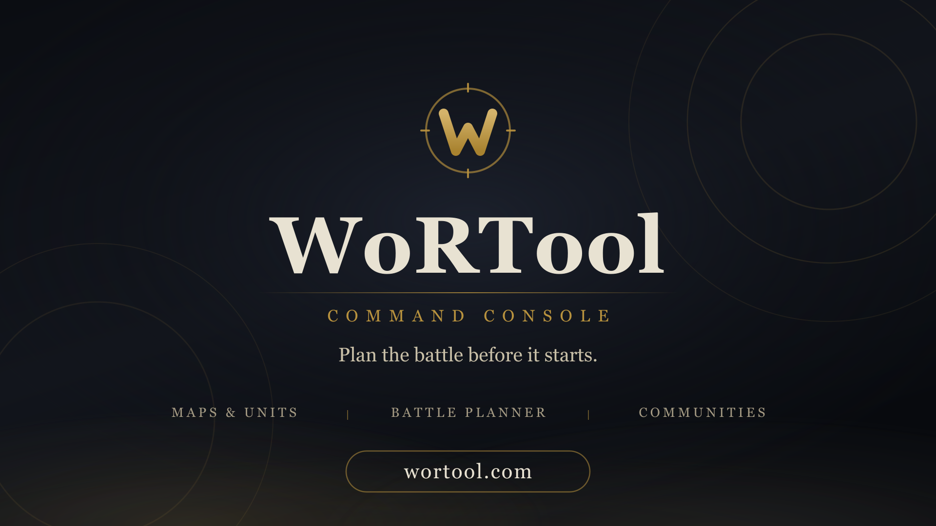
Slates
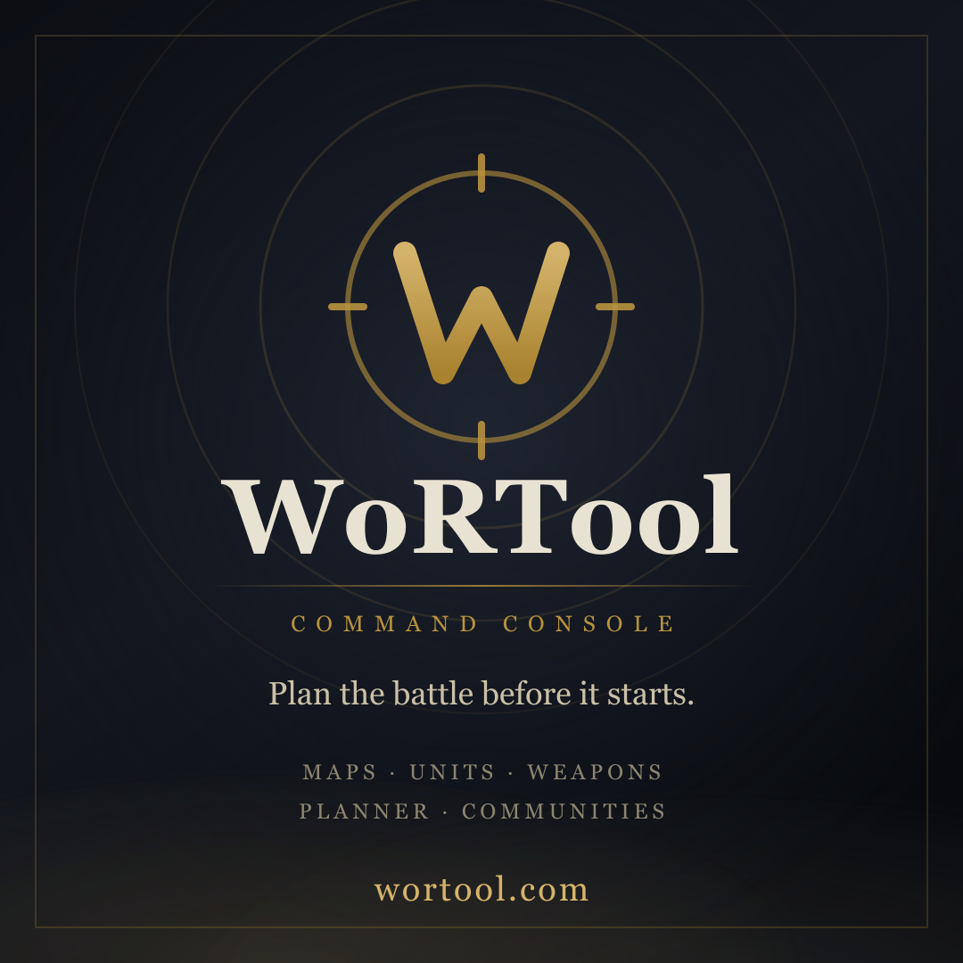
A full frame carrying the name and the address. One built to fill the screen during a break, one drawn separately to still read when it is shown small.
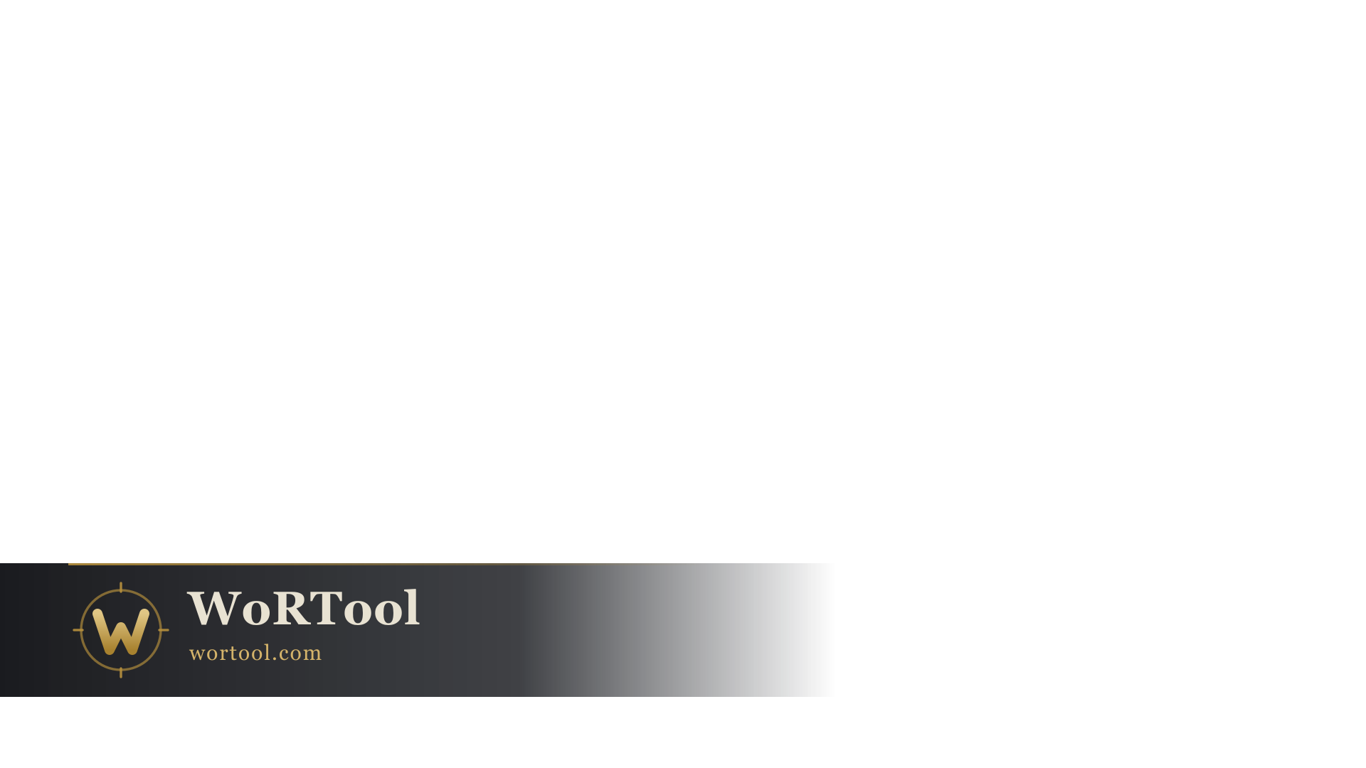
Video and stream overlays
Made to sit on top of your own footage. The grid showing through each preview is the page behind it, not part of the artwork.
 Transparent
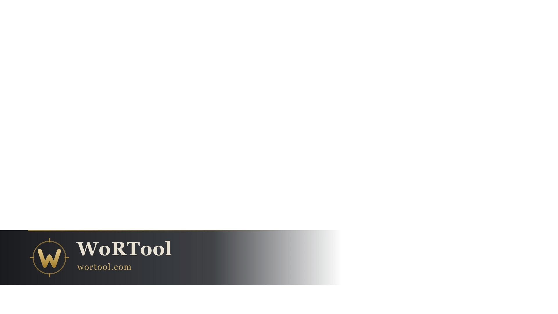 Transparent
 Transparent
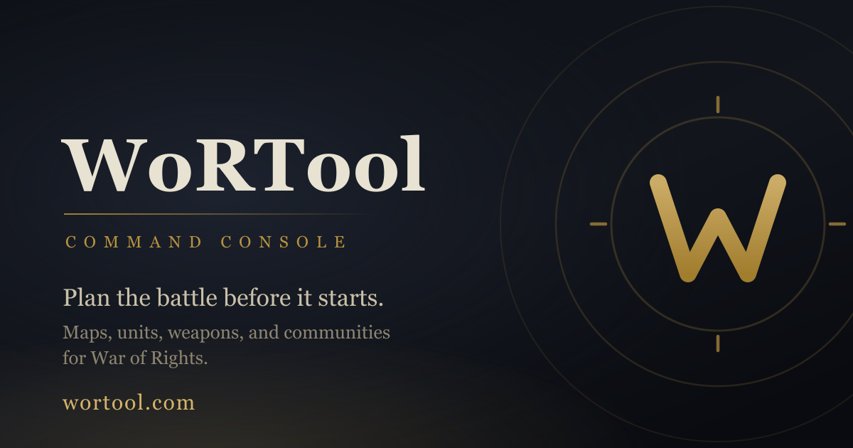
Share images
For a post, an embed, or a link preview.
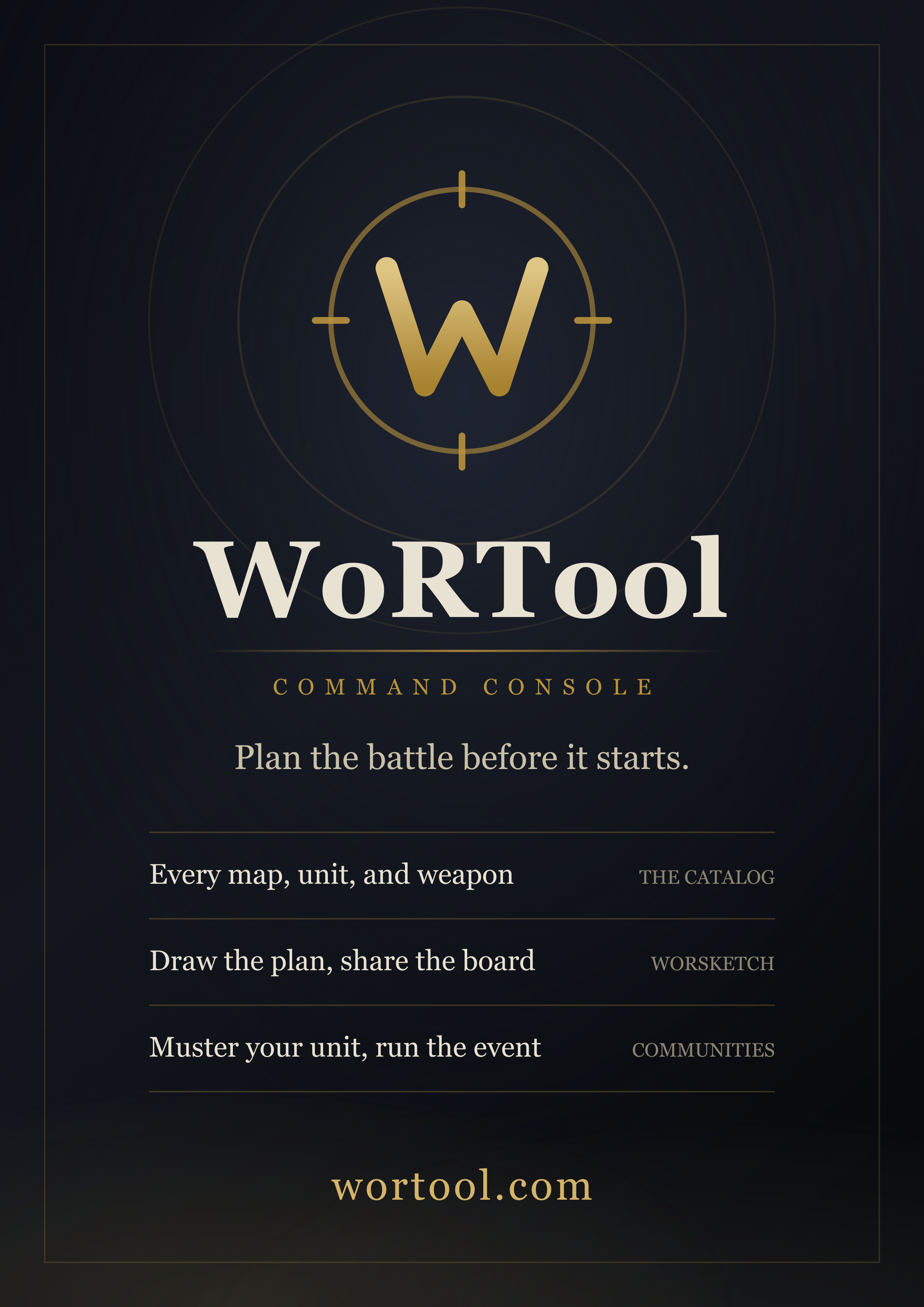
Posters
The one piece with room to say what the site actually does.
Icons
The compass mark on its own, no words.


Colors
For matching WoRTool in your own overlay or thumbnail. The type is a transitional serif; the kit is set in Georgia so a render comes out identical on any machine. Click a value to copy it.
A few things to avoid
The only conditions attached to any of this.
- Do not recolor the compass mark or the wordmark, and do not put either on a light background. The artwork is built for the dark ink it ships on.
- Do not stretch anything. Every file is already at the ratio it was drawn for. If you need a size that is not here, ask and one will be made.
- Do not rebuild the logo by hand from the icon plus your own type. Use the files that already carry the wordmark.
Need a size that is not here, or artwork for something this kit does not cover? Ask, and one will be made.